Thx Peky! Your work is fantastic as well. I find myself doing more in Procreate than anything else — it’s so darn convenient & versatile!
Started this in pencil and ended it in pencil! Never made the switch-over to pen because I was having too much fun. Nothing like the feeling of a pencil on a buttery smooth piece of Moleskine! ![]() (used HB and 2B)
(used HB and 2B)
2 Likes
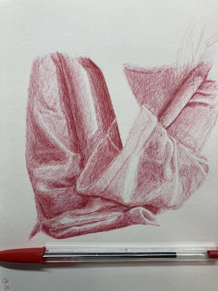
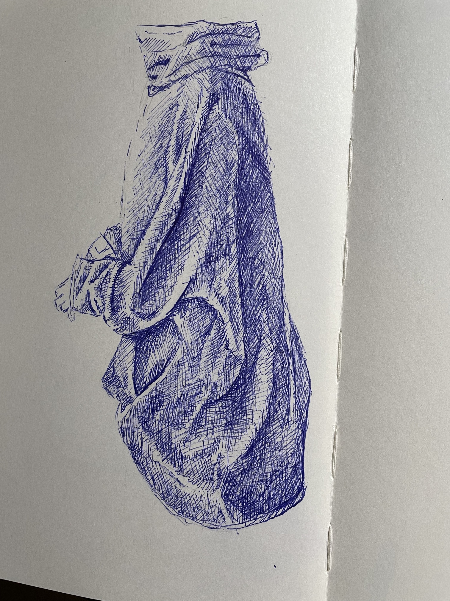
My Grey Sweatshirt. It was a little fight with the BIC 1.6. Drooling when giving some pressure and ‘eating’ the paper when staying light, sigh.
2 Likes
Challenging for sure! I’ve started this particular one 5 times and about 1/3 of the way, I say “nah” and start again. Might go on to the purple bag and come back to the sweatshirt. You and France make the most beautiful marks!!
2 Likes
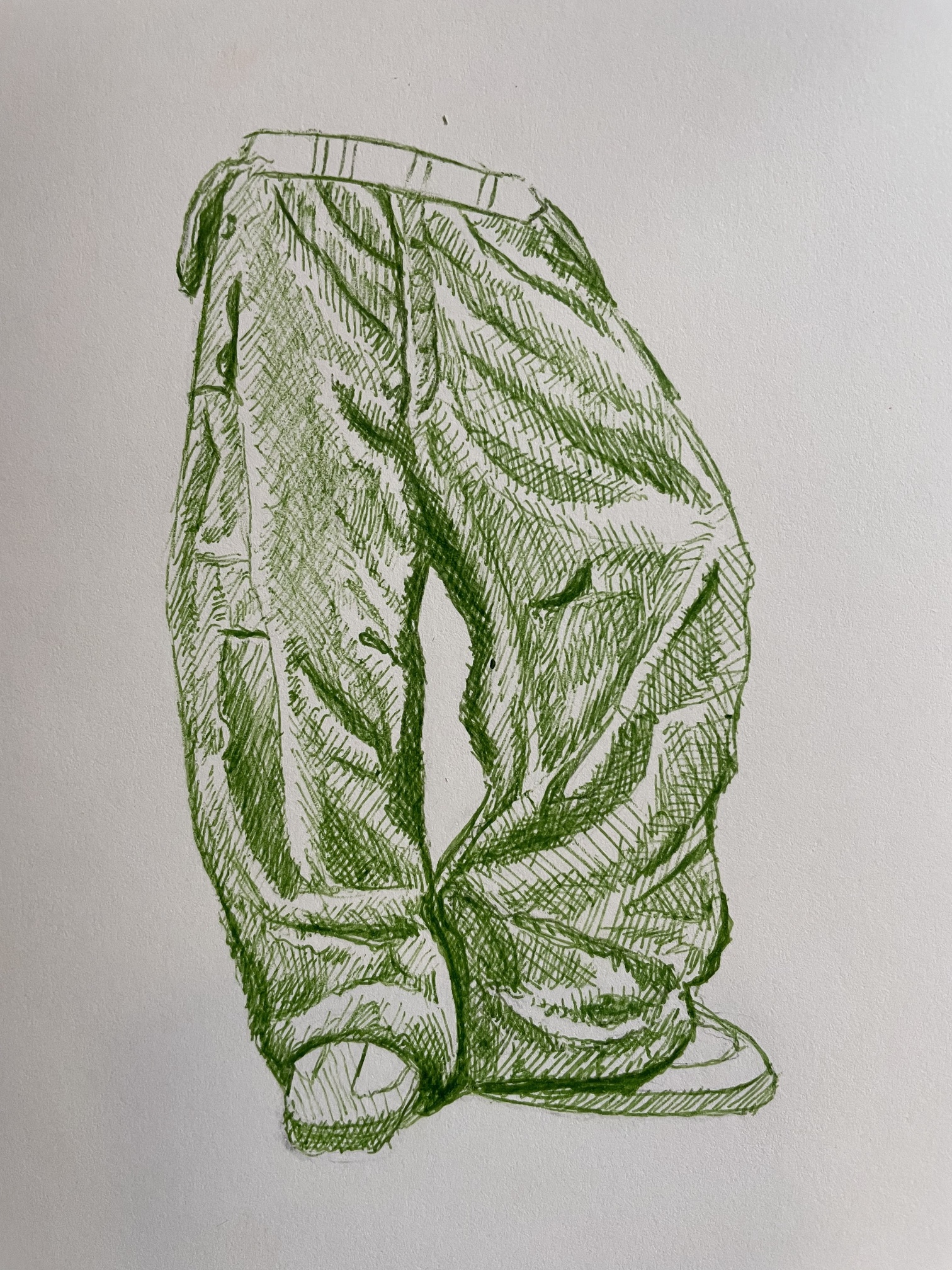
Here’s my attempt at “green pants”. I was challenged by this drawing but learned from it and hope to do a better job on the next drawing of the course.
4 Likes
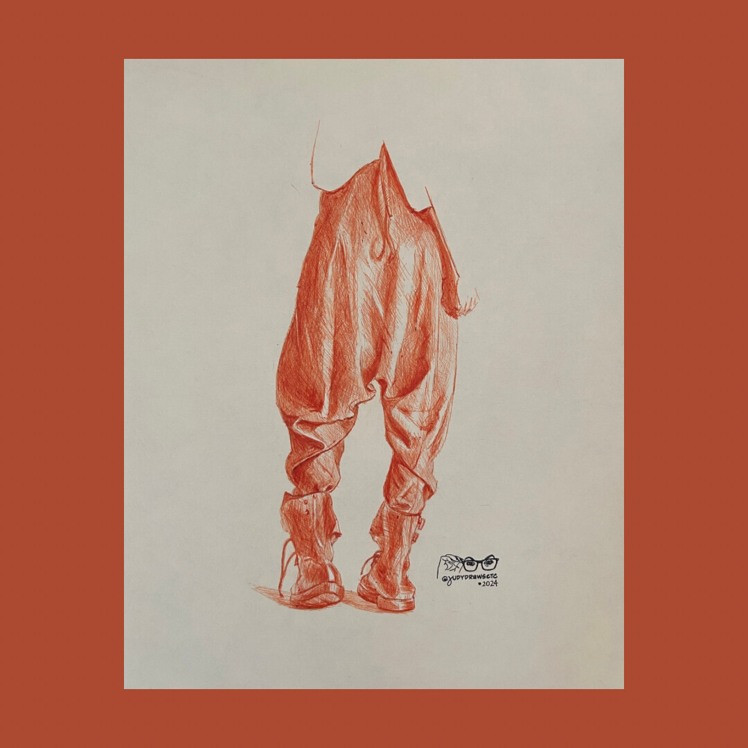
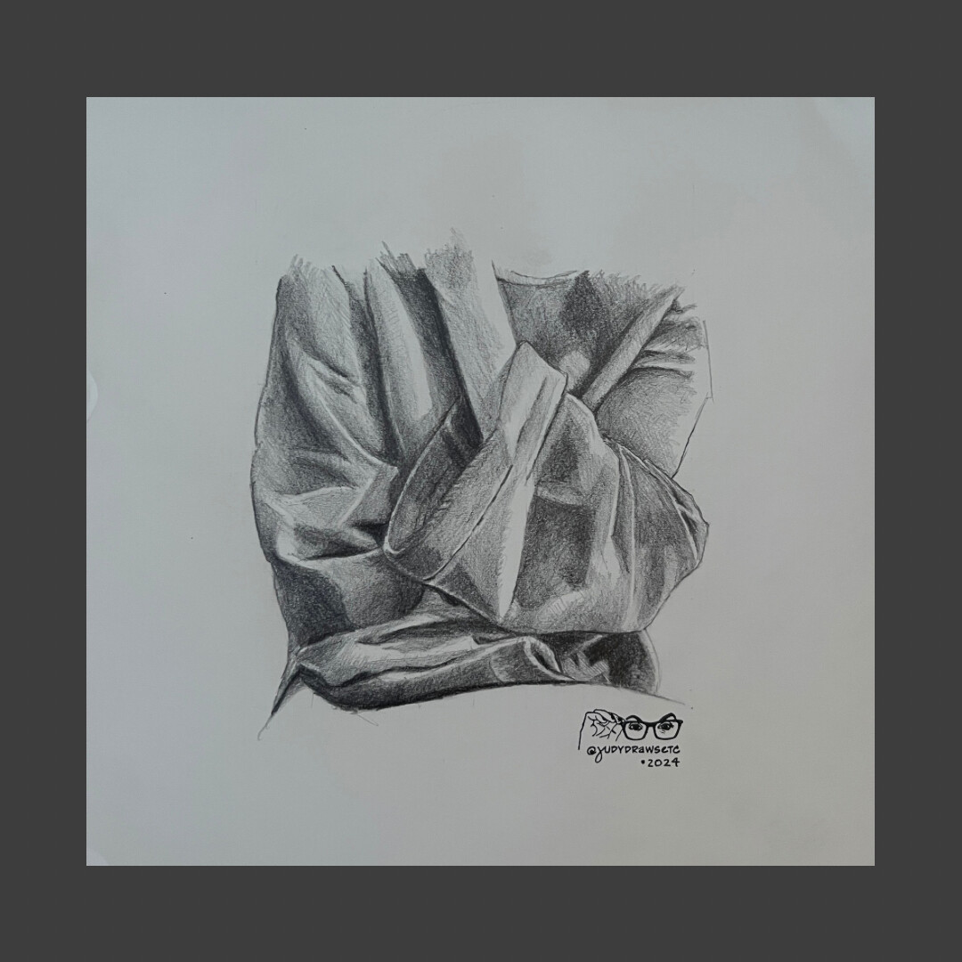
And here’s lesson 5, the finale of this awesome course! Orange Papermate Profile 1.0 on toned paper. I had to force myself to stop because I could have kept on scribbling—and obviously I wound up going too dark on the right side. Oh well! I will definitely keep practicing folds because we all know that that’s what makes progress! ![]()
4 Likes
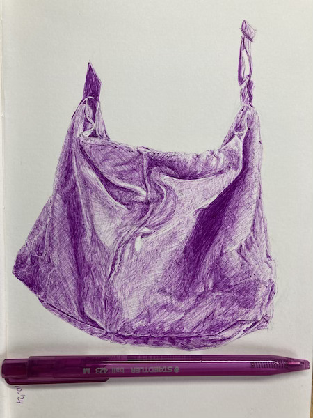
It looks beautiful with realistic folds to me. I hear you about keeping on scribbeling. The purple bag I’m drawing now may end as a deep purple rectangle without any folds visible ![]()
I love how light you went with that thick pen! This is fab! ![]()
1 Like
Aww thanx! I erase my initial pencil sketches and restart them over and over again. It’s rare I get it right the first time. ![]()
1 Like
This looks great to me!
1 Like
Great suggestion! Thank you! You make all your drawings look so effortless. Good to know you have to start over occasionally. ![]()
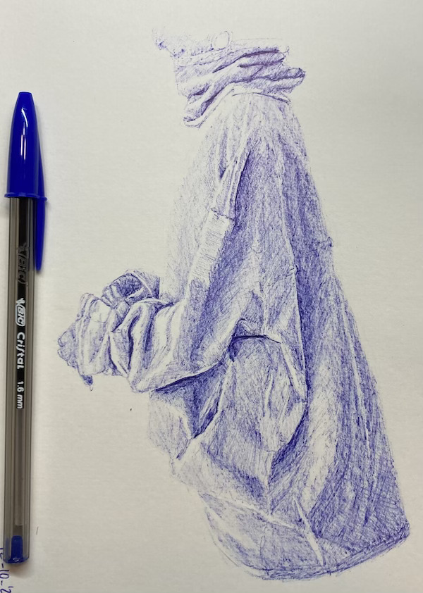
Kyra, i have to say the 1.6mm are harder to handle for folds – which is why I end up doing them with a medium Bic now. But I love the delicacy and the fuzziness of this.
2 Likes
I don’t think it is too dark on the right side at all! In fact the shadow cast by the arm works that much better against some texture. Wow, beautiful work, Judy!
I think you did great. The intense dark makes the fabric look a bit shiny – and that works, There was no requirement as to what fabric we were rendering here. That’s a great start!
1 Like
What I learned sofar.
-
The bigger the drawing the larger the area to fill. OK, I already knew this but keep forgetting it.
-
A lot of light layers can get too dark to your taste.
-
The right paper and pen can make a difference.
-
Drawing folds needs perseverance and practise.
-
Look to your drawing from a distance.
-
When in doubt about your drawing, ask someone who likes “Find 7 differences”.
3 Likes
Holy moly, this is amazing! ![]()
Kyra, what a great drawing!! Love it!
Thanks Judy and Becky! I found it a challenging drawing. Started on the west-side fairly dark and was overwhelmed with the large light area in the middle with all the wrinkles. Drawing bigger means more room for adding detail, but more work filling larger areas evenly. Happy with the big fold on the east side.
1 Like
5 Likes