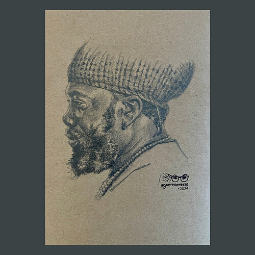
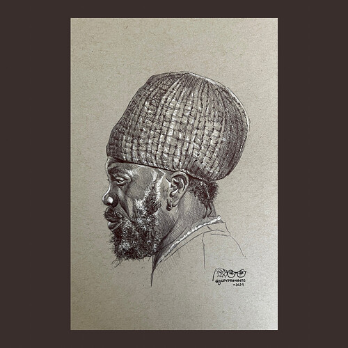
Here’s portrait #2—it also happens to be the 2nd time I’ve drawn him. The first time was back at the beginning of this month, which I have included here as well. As you can see, I tackled the complete hat in that pen drawing, but just suggested it in the pencil one!
I fell in love with toned paper the first time I tried it. These are great, Judy!
Both are stunning!
Did you discover new aspects in the portrait the second time you drew it after watching the course?
Love this, Judy! ![]()
![]()
![]()
Right now I only have gray and tan (& some darker tan craft paper), but I want to explore more tones!
Most definitely—I always pick up techniques from watching France draw. I love the beard more in the pencil drawing. It’s always a challenge for me to render white/gray hair without white pastel or white gel pen!
Thx so much Becky! ![]()
Judyyy! this is soooo good! Gosh…i’m in love with the first image. what pen did you use? it’s so soft against the toned paper.
Thanx so much! ![]() The top one is the one in pencil (on brown craft paper) & the other is black ballpoint pen on toned gray paper (with white highlights). I always have a hard time taking pics of shiny graphite!
The top one is the one in pencil (on brown craft paper) & the other is black ballpoint pen on toned gray paper (with white highlights). I always have a hard time taking pics of shiny graphite!
my first exposure was white conté crayon on black paper, but the mid-tone papers are where it’s at. ![]()
![]()
I have some black paper, but I think I’ve done a grand total of ONE drawing on it! I should probably experiment with it some more.
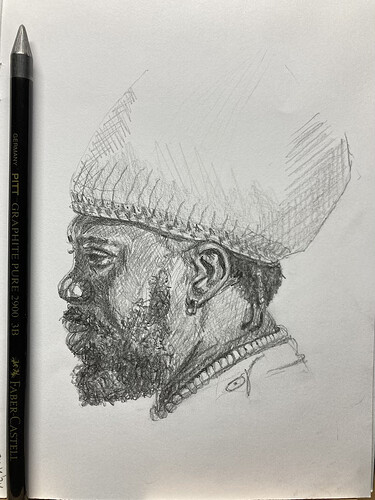
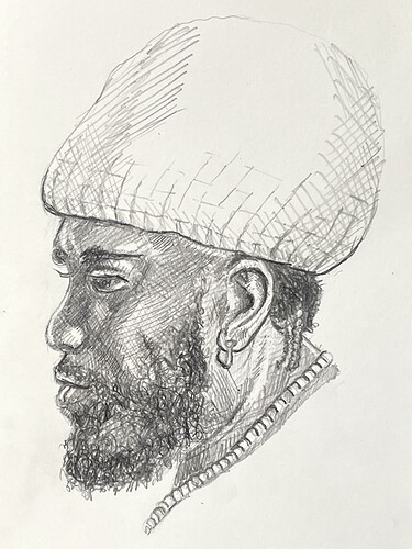
Is this the right place to post my portrait 2?
I admire the persistence of those who will draw the hat.
My choice of pencil was not the best. Relative too big or the drawing too small.
Anyhow, it was a really fun to draw, especially the beard.
I started drawing 2 years ago. With the courses from France the learning curve is steep. I’m not on “social media” so being able to see now what other people pick up from the courses is amazing. Thank you for those who organised this platform and to those who are willing to show their creations.
I think this is beautiful, Kyra! I thought about using my Pitt graphite for the beard—now I wish I did!
There is no wrong place! And this drawing is fantastic! ![]()
![]()
Nice! The graphite looks blue and very nice soft tone. Almost thought it’s colored pencil but the softness felt more like graphite.
I like the Pitt graphite for the lack of silvery shine. For the thinner lines in the drawing I should have used a normal size pencil. Or, ala France, shape a point to the lead and rotate the pencil for a broad or thin stroke. Next time better, if I remember…
The pencil version is perfect — albeit unfinished
Beautiful work, Kyra! ![]()


